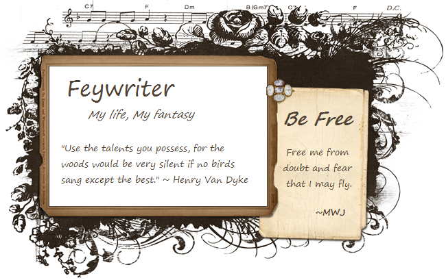
With the new tab options integrated into Blogger, I’m considering giving a makeover to my blog. Fits well with my Spring Cleaning theme this month. Anything I should consider regarding font size, colors? Anything you hate to see? Preference over two or three columns? Are flowers a turn off for the guys? In the end, I’ll be going with something that works for me, but I don’t want to turn you away!

I mostly read your blog in a reader. But when I do hop over to the actual page, I have a hard time reading the turqoise print on the olive green page.
ReplyDeleteIf you are planning to have more in your sidebars, then I suggest 3 column. Or if you plan to advertise, because then it breaks it up more.
I've been meaning to give my blog a makeover too.
I can't wait to see what you come up with!
Thanks for the feedback, Nikki. :-) One of the reasons I'm leaning toward 3 column is that 2 looks so narrow on my widescreen! The color scheme is a big reason I want a new change. I used to love it, but it's starting to annoy me now. LOL.
ReplyDeleteI'll second the turquoise-on-olive thing. My eyes prefer dark text on light backgrounds :)
ReplyDelete